General operation of the overview page
In this chapter, we’ll describe the different elements of a Craft CMS overview page. These elements are used in many places throughout the Control Panel, such as in Entries, Categories, Assets, and Users. The way they work is largely the same across all sections.
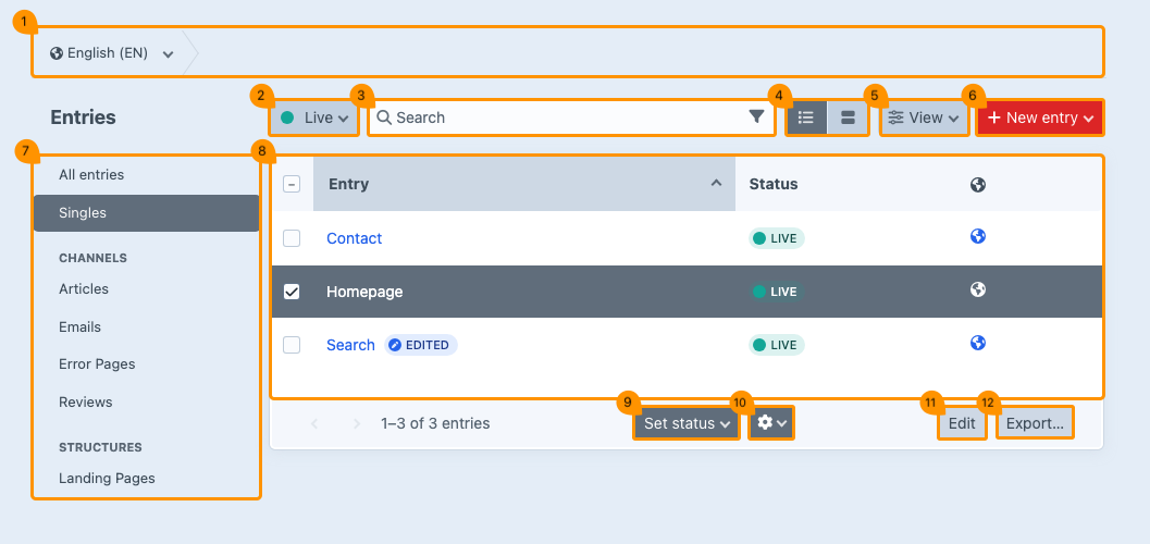
# Breadcrumb & multisite
(regarding image block 1)
# Breadcrumb
At the top of the page, you’ll see a path called the breadcrumb. This navigation aid precisely shows where you are within the structure of the website. Each step in the path is clickable, allowing you to easily return to a previous page or category.
Some steps have a menu, which you can recognize by the downward-pointing arrow.
# Multisite
When you manage multiple sites within a single Craft environment (multisite), the breadcrumb always starts with a button that displays a globe icon. From there, you can switch between the sites.

Your site in another language is considered a separate site in Craft.
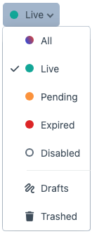
# Filter by status
(regarding image block 2)
With the filter, you can limit the view to entries with a specific status. For example, you can choose to display only active pages.
Click on the status filter button to open the dropdown menu with status filters. The available options may vary per section section, but in general, the following indicators apply:
| Status | Definition |
|---|---|
| Green | Live or active |
| Orange | Pending |
| Red | Expired or disabled |
| Transparent | Disabled pages |
| Drafts | Still in progress |
| Trashed | Deleted pages |
# Search & filtering
(regarding image block 3)
# Search
Use the search bar at the top of the page to search for specific keywords. This allows you to quickly find pages that contain these words, if they exist.
You can also combine the search function with the status filter button.
# Filtering
While searching, you can apply additional filters to refine your results. This can be useful, for example, when you want to search within a specific date range or for entries by a particular author.
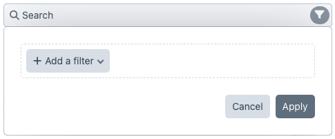
- Click the funnel icon on the right side of the search bar
- Select +Add a filter
- Select the desired filter (e.g., date range or author)
- Set the filter criteria
- Click Apply to refine the results
Gray funnel icon = unused White funnel icon = in used
You can apply multiple filters at the same time.
# Display option
(regarding image block 4)
# Table view
Select the left button for a table view (list).
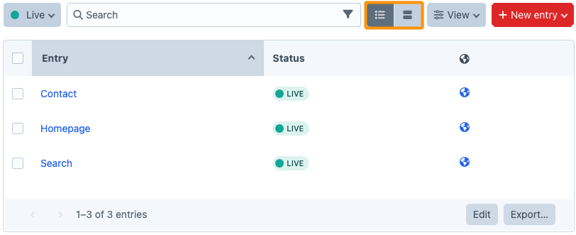
# Card view
Select the right button for a card view.
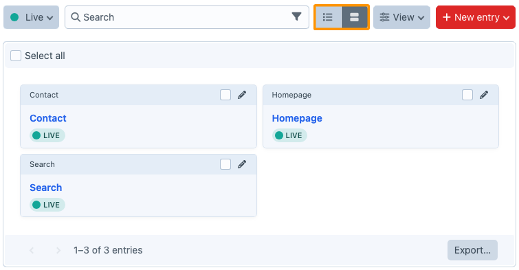
The selected view is saved per section.
# Sorting & column view
(regarding image block 5)
You can sort the data in the columns and toggle table columns with specific information ON or OFF using the View button.
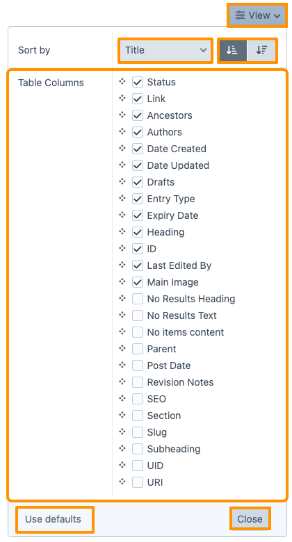
| Part | Explanation |
|---|---|
| (1) View | Button opens a menu. |
| (2) Sort by | Additional options to sort by specific attributes or fields, such as title or date. |
| (3) Sort buttons | Buttons to sort in ascending or descending order. |
| (4) Table columns | Select the columns you want to display by checking them. Want to change the order? Drag a column to the desired position by grabbing it at the four dots. |
| (5) Use defaults | Button restores the original settings. |
| (6) Close | Button closes the window. |
When card view is enabled, you cannot select table columns.
# Adding new content
(regarding image block 6)
You can sort the data in the columns and toggle table columns with specific information ON or OFF using the View button.
| Part | Explanation |
|---|---|
| (1) View | Button opens a menu. |
| (2) Sort by | Additional options to sort by specific attributes or fields, such as title or date. |
| (3) Sort buttons | Buttons to sort in ascending or descending order. |
| (4) Table columns | Select the columns you want to display by checking them. Want to change the order? Drag a column to the desired position by grabbing it at the four dots. |
| (5) Use defaults | Button restores the original settings. |
| (6) Close | Button closes the window. |
When card view is enabled, you cannot select table columns.
# Adding new content
(regarding image block 6)
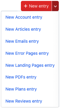
You can add new content using the red New entry button in the top right corner of the page, or by opening the dropdown menu next to this button. A list will appear where you can select the type of entry you want to add.
# View center menu
(regarding image block 7)
The layout and view of the middle menu partly depend on the content. During the development of your website, the developer ensures that this menu has a logical and well-structured setup.
In most cases, only your website developer can make adjustments to the view of this menu.
# Editing existing content
(regarding image block 8)
By simply clicking on the title of an entry, you can edit existing content. For more details on this topic, refer to the chapter Entries.
If the word 'edited' appears in blue next to a title, it means that the changes in this entry have not yet been saved and are therefore not visible in the live environment.
# Set status
(regarding image block 9)
As soon as you check one or more entries on the overview page, the Set status button will appear at the bottom center. This allows you to enable or disable the selected entries simultaneously.

(regarding image block 11)
When you select one or more entries on the overview page, a menu with a gear icon will appear at the bottom center. The option you choose will then apply to all selected entries.

| Function | Description |
|---|---|
| View entry | Opens the live page of the selected entry. |
| Edit entry | Edits the selected entry. |
| Create a new entry before | Creates a new entry before the current selection. |
| Create a new entry after | Creates a new entry after the current selection. |
| Duplicate | Copies the selected entry and places it in the same location as the original. |
| Copy | Copies the selected entry and places it on the clipboard to be used elsewhere. |
| Move to… | Moves the selected entry to another category. |
| Delete | Deletes the entry. |
When you select multiple files at the same time, some options in the dropdown menu may not be available, since certain actions cannot be performed in bulk.
# Edit inline
(regarding image block 11)
Some information can be edited directly within the entry row. This is called inline editing. The advantage of this feature is that you can make small adjustments without having to open the full content page of the entry and search for the right place to make the change.
- Click Edit. The overview page will now switch to edit mode.
- Edit the desired fields in the rows.
- Choose Cancel if you want to stop. Any changes will be lost, and you will return to the overview page.
- Choose Save if you want to store your changes. You will then return to the overview page.
# Export
(regarding image block 12)
You can export the data from a view using the Export button at the bottom right of the page. This can be useful, for example, to create a backup or to import the data into another system. Select the desired export type, file format, and optionally a row limit. Then click Export to generate the file.
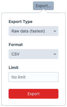
When you have a large amount of content, it can be useful to limit the export to, for example, 10 rows the first time. This allows you to quickly check whether you’re getting the intended result.